Colour is more than decoration — it’s a silent emotional architect. In interior design, a rug isn’t just a functional piece; it’s a powerful mood-shaper. Especially with tufted rugs — which cover significant floor area and often serve as a room’s visual anchor — the colours you choose can deeply influence the atmosphere and emotional tenor of the space. For the Valhak brand, understanding how different rug colours resonate with people psychologically is not just design strategy, but a way to help customers curate spaces that feel both beautiful and emotionally supportive.

In this article, we’ll explore how colour psychology applies specifically to tufted rugs, examine the emotional impact of popular hues, and offer practical guidance for using colour intentionally to shape room mood.
1. Why Colour Psychology Matters in Rugs
When we think about colour psychology, we often focus on walls or furniture. But rugs play a unique role:
- Large Visual Field: A rug can occupy a large portion of a room’s visible surface, making its colour more dominant in perception than smaller accent pieces.
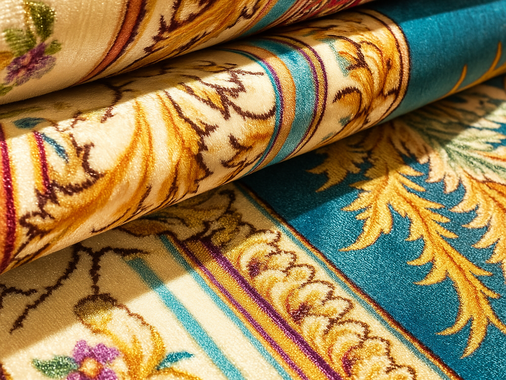
- Tactile Influence: Tufted rugs bring texture — the way light interacts with tufting, pile, and yarn variations influences how colours are perceived.
- Emotional Anchor: Because rugs are underfoot, they serve as an emotional grounding point. The colour isn’t just seen — it’s lived with, day in, day out.
- Design Cohesion: Rug colour helps tie furniture, walls, and other textiles together, acting like a visual glue that reinforces or changes the mood.
Given these roles, choosing the right colours in your tufted rugs is a high-leverage decision. Let’s dive into how different hues act on human emotions and behavior.
2. The Science Behind Colour & Emotion
To understand why colours affect mood, it helps to look at what science and psychology say.
- Broadly, warmer hues (reds, oranges, yellows) are stimulating, energizing, and attention-grabbing; cooler hues (blues, greens, purples) tend to calm, soothe, and stabilize.
- A recent study in immersive virtual reality mapped emotional and physiological responses to 15 calibrated hues. It found that red-purple hues elicited high arousal and feelings of dominance, while blue-green ones were rated most pleasurable.
- According to interior design psychology research, cool colours can reduce tension and blood pressure, while warm colours can enhance motivation or social interaction.
- In design contexts like rugs, the emotional associations of colour are also shaped by cultural norms, personal memories, and the interplay with texture and pattern.
In short, the hues you choose for a tufted rug don’t just decorate a space—they communicate emotional intent.
3. Colour Profiles and Their Mood Effects in Tufted Rugs
Below is a breakdown of common rug colours, their psychological associations, and how they might influence a room’s mood when translated into tufted rugs.
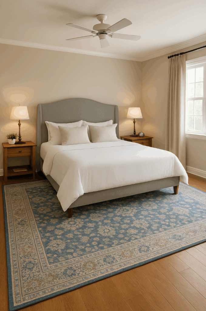
Blue: Calm, Focus, and Trust
- Emotion & Physiology: Blue is frequently linked to tranquility, stability, and lowered anxiety. Some studies even suggest that blue can reduce blood pressure and heart rate.
- Design Implications: In a tufted rug, shades like sky blue or teal create a soothing underfoot layer that supports restfulness or concentration. Navy blue (a darker tone) can anchor a space, giving it a composed, grounded feel.
- Where to Use: Ideal for bedrooms, reading nooks, home offices, or meditation spaces. Rug colour psychology experts often recommend blue in rooms where calm or focus is desired.
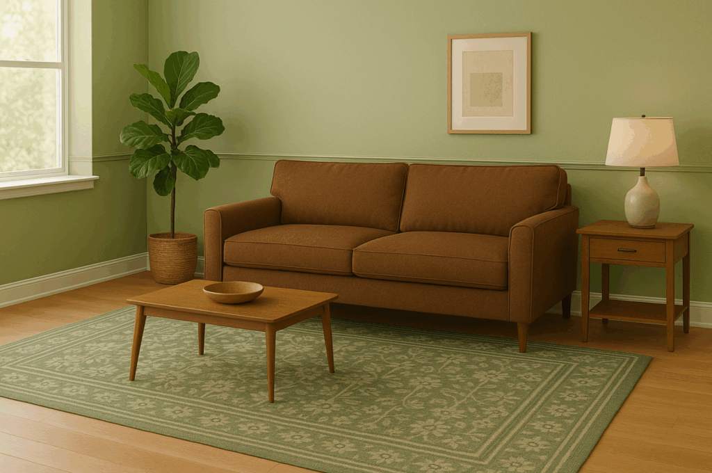
Green: Balance, Rejuvenation, and Natural Harmony
- Emotion & Physiology: Green strongly evokes nature, renewal, and balance. According to design psychology, it’s very effective at reducing stress and creating a sense of equilibrium.
- Design Implications: In a tufted rug, green yarns—from soft sage to deep emerald—lend a grounding, organic feel. The pile and texture can even amplify the sensation of “grass underfoot” or a foliage motif.
- Where to Use: Great for living rooms, family rooms, or any space where you want a connection to nature without being overly stimulating.
Yellow: Optimism, Warmth, and Creativity
- Emotion & Physiology: Yellow often signals joy, optimism, and mental clarity. It’s strongly associated with sunlight and warmth.
- Design Implications: A tufted rug in buttery yellow or mustard can brighten a space emotionally and visually. But high-chroma yellows can feel overwhelming if overused; moderate tones often work best.
- Where to Use: Perfect for kitchens, creative studios, children’s play areas—or anywhere you want to spark energetic, cheerful interaction.
Red & Orange: Energy, Passion, and Conversation
- Emotion & Physiology: Red ramps up arousal, heart rate, and attention. Orange sits nearby, offering vibrancy and creativity without as much intensity.
- Design Implications: In a tufted rug, red or burnt orange creates a bold visual anchor. Patterns or neutral accents can balance the intensity. According to rug psychology, these colours encourage social interaction.
- Where to Use: Dining rooms, entryways, entertainment areas—places where energy, warmth, and conversation are appreciated.
Purple: Luxury, Creativity, and Introspection
- Emotion & Physiology: Purple is often tied to creativity, imagination, and sometimes a sense of luxury or spirituality.
- Design Implications: A tufted rug in lavender or plum can feel sophisticated or dreamy, depending on tone and texture. The pile can enhance depth, making purples feel rich and enveloping.
- Where to Use: Bedrooms, study zones, creative lofts, or reading corners where introspection or inspiration is welcome.
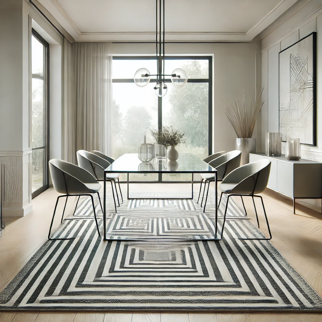
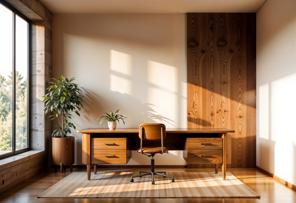
Neutrals (Beige, Cream, Gray): Stability, Simplicity, and Timelessness
- Emotion & Physiology: Neutral tones provide a calm, grounding backdrop. They reduce visual clutter and give the brain a breather.
- Design Implications: In tufted rugs, neutrals highlight texture. The crisscross of loops, pile directions, or subtle patterning becomes more visible—and the rug becomes a tactile and visual anchor without dominating.
- Where to Use: Living rooms, offices, or any space where you want flexibility to layer in accent pieces, art, or colored furniture.
4. Advanced Considerations: Colour Harmony & Context
Choosing a colour isn’t just about picking a hue; it’s about how that hue relates to the rest of your space and goals.
Colour Relationships & Harmony
A recent study on colour pairing found that certain hue separations (on the color wheel) align more naturally with human aesthetic preferences — and these alignments often mirror the hues found in nature.
When designing with rugs, consider harmony techniques:
- Monochromatic schemes (different tones of the same hue) for depth and serenity.
- Analogous colours (neighbouring colours on the wheel) to subtly shift energy without jarring contrast.
- Complementary colours (opposite on the wheel) to create dynamic tension and visual interest when paired thoughtfully.
Impact of Shade, Saturation, and Texture
- A murky sage green rug feels very different from a vivid lime-green one — saturation matters.
- Texture and pile can affect how colour reads. High-pile tufted rugs can soften and diffuse colour; low-pile or looped tufts present more saturated, crisp tones.
- Lighting is critical. Natural light brings out the true richness of a rug’s colour, while artificial lighting can shift the perceived hue dramatically. Always test rug samples in your actual space.
Cultural and Personal Associations
- Color perception is not purely universal. Cultural associations deeply influence how people feel about certain colours. For example, in some cultures red means good luck; in others, it signals warning.
- Personal history matters too: someone might associate blue with childhood comfort, or yellow with a sad memory. Encourage customers to reflect on what particular shades evoke for them.
5. Practical Guidance for Buying Rugs
Here are actionable tips for shopping for tufted rugs, grounded in colour psychology.
Define the Purpose of the Room
- Is this a restful space (bedroom)? Go with cool, calming blues or greens.
- Is this a social/energetic space (dining or living room)? Consider warm reds, oranges, or cheerful yellows.
Request Yarn Samples
- Ask for small yarn or tufting samples. Bring them into your room; observe them at different times of day under different lighting.
- Pay attention not just to the colour, but how the texture affects its appearance.
Balance with Furniture & Decor
- Use colour harmony principles. If your walls are neutral, a bold rug can anchor. If your furniture is colorful, choose a more subdued rug to ground the room.
- Think about layering: a neutral or muted rug gives flexibility to layer bold cushions or throws.
Consider Scale & Pattern
- Large-scale patterns in warm colours can energize, while subtle patterns in cooler colours add calm.
- In smaller rooms, a saturated colour can feel cozy; in larger rooms, it can provide intimacy.
Reflect on Long-Term Emotional Goals
- Are you designing for daily living, or for special moments?
- Will you want to feel relaxed, or inspired, or connected? Let the rug’s colour support that emotional intention.
6. Case Studies & Examples
To illustrate how colour psychology in tufted rugs plays out in real spaces, here are a few hypothetical but realistic Valhak-style use cases:
- Serene Bedroom Retreat: A sky-blue tufted rug under the bed softens the room. Paired with cream bedding and natural wood furniture, the colour promotes calm and lowers tension, supporting restful sleep.
- Energetic Dining Room: A deep red or terracotta tufted rug under your dining table becomes the emotional heart of the space. It encourages conversation, appetite, and warmth.
- Creative Studio or Office: A mustard-yellow rug adds optimism and mental clarity. Surrounded by white or charcoal furniture, the yellow spark supports creativity without feeling chaotic.
- Reading Nook / Library: A sage-green rug, combined with potted plants and a textured tuft, brings the outdoors in and fosters balance, focus, and restoration.
- Luxurious Living Area: A plum or lavender tufted rug paired with metallic accents (e.g., brass or gold) gives a touch of introspective glamour—creative and refined.
7. Potential Pitfalls & How to Avoid When Choosing Rug Colors
Even with the psychological power of colour, there are risks if applied without care:
- Overstimulating with Intense Warm Colours: Too much red, orange, or bright yellow can become exhausting. Solution: use accents, or tone down with neutrals.
- Colour Not Matching the Light: Buying a rug in one lighting environment and using it in another can backfire. Always sample in the final room, under both natural and artificial light.
- Ignoring Personal Associations: A colour that “should” feel calming may not for everyone. Ask yourself: how do I feel when I see this shade?
- Neglecting Texture: The same hue can feel very different in different pile types; a rough or thick pile may seem darker, softer.
- Trendy Over Timeless: While bold colours can be exciting, think long term. Will that electric-orange rug still feel joyful in five or ten years?
8. Conclusion
Colour psychology is not a design gimmick — it’s a foundational tool. When it comes to tufted rugs, the hue you choose has a profound emotional impact: calming blues ground and soothe, energetic reds ignite warmth and connection, verdant greens bring balance, and cheerful yellows uplift. Neutrals anchor with stability; purples usher in introspection or elegance.
9. FAQs
Can the colour of a rug really change how I feel in a room?
Yes. Research and design-psychology show that colours influence emotion and even physiology. Choosing the right rug colour can promote calm, energy, or balance.
What colour rug is best for promoting relaxation?
Cool colours like soft blues and sage greens are generally best for relaxation. They help lower stress and create a peaceful ambiance.
Is it okay to use a bright rug in a small room?
Yes — a saturated or warm-coloured rug can make a small space feel cozy. But balance it with softer or neutral tones in furniture or walls so the colour doesn’t overwhelm.
How should I choose a rug colour if I want to boost creativity?
Consider vibrant but not too harsh colours: mustard yellow, teal, or lavender tufted rugs can stimulate creative energy without being overstimulating.
My space has poor natural light — what rug colours work best?
In low-light rooms, lighter hues or mid-tones (like pale blue, soft beige, or pastel greens) help brighten the space. Also, textures (like a higher pile) can catch and reflect what light there is, enhancing the colour’s effect.