ブラウンはしばしば過小評価されがちで、ニュートラルすぎる、平凡すぎると思われている。しかし2025年、デザイナーは意図的な色の組み合わせのための万能キャンバスとして、ブラウンの土のような魅力を取り戻しつつある。落ち着きのあるニュートラルカラーから大胆なアクセントカラーまで、ブラウンの温かみと深みを高め、モダンで居心地のよい、エレガントで地に足のついたインテリアをつくる10色をご紹介します。
1. ブラウンが新しいグレーである理由
かつては "落ちこぼれ"、あるいは "野暮ったい "とさえ思われていたブラウンが、今やどこにでもあるグレーに代わる、自信と安らぎを与える色として急浮上している。複数の2025年トレンドレポートによると ブラウン系が強いトレンドパントンネーミング モカ ムース シャーウィン・ウィリアムズやベンジャミン・ムーアなどは、暖かみのあるアースブラウンを「カラー・オブ・ザ・イヤー」に選んだ。家の売り手は、冷たいグレーよりもモカやチャコールブラウンのような中間色のブラウンを選ぶことで、再販価値を数千ドルも高めている。ブラウンの秘密?温かみがあり、地に足がつき、驚くほど万能です。特に、リビングルームやベッドルームなど、快適さが重要なスペースには最適です。
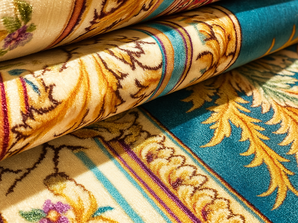
2. ティール&ブルーグリーン
ティールとその同系色のブルーグリーンは、ブラウンの暖かさと見事な視覚的対比をもたらし、空間に活気と落ち着き、洗練されたスタイルを吹き込む。
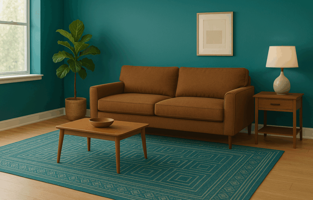
ブラウンとの相性が良い理由
- 色温度の調和 ブラウンは温かみと大地を感じさせる。ブルーとグリーンの中間に位置するティールは、単調さを和らげ、豊かさを高める冷静なバランスをもたらす。思慮深く組み合わせれば、このデュオは完璧な感情の和音を奏でる。
- 視覚的コントラスト ブラウンは手触りのよい質感を、ティールは新鮮な透明感をもたらします。レザーの家具でも、フローリングでも、シェルフでも、クッションやラグ、壁などにティールをアクセントとして取り入れると、光り輝くような上質感が生まれます。
関連記事 グレーのソファに合うラグは何色?2025年究極のガイド
インテリア・スタイリング戦略
アクセントにティール、ベースにブラウン
- を使用する。 チョコレートブラウンの革張りソファ アンカーとしてティールカラーのスローピローや柄物のラグを敷けば、リッチな読書コーナーに。
- を選ぶ ティールランプベースまたは花瓶 ダークウッドのサイドテーブルに、視覚的なパンチを効かせた小さな工夫を施している。
壁はティール、家具はブラウン
- 壁塗り ベンジャミンムーア 海 ガラス または落ち着いたティールは、隣接する茶色の木の色調を圧迫することなく、深みをもたらす。
- ムーディー・スキーム」: ティール タイル またはキャビネット 温かみのあるウッドアイランドと組み合わせ、ブラウンのエレメントで縁取り、バランスを保っている。
ニュートラルカラーとのミックス
- ペア ティールとブラウン クリームやトープ、グレイッシュな色を使ってパレットを柔らかくし、寒色と暖色の切り替えを容易にする。
- デザインのヒント: 均衡比-ティールを主張し、ブラウンをグラウンディング、ニュートラルカラーをブリッジとして使う。
テクスチャーレイヤーで奥行きを出す
- コンバイン ベルベット・ティールクッション ラフに織られたブラウンのラグと合わせたり、素朴なオーク材のコーヒーテーブルと、なめらかなティール色のアクセントチェアを合わせたり。
- ベルベット、リネン、レザー、ウッドのコントラストが視覚的な面白さと触感を加える。
パターンとアクセント
- 用途 ストライプまたは幾何学模様の生地 茶色とティールをブレンドして、枕やラグ、カーテンにパレットを織り交ぜる。
- 統合 真鍮またはゴールドのアクセント-照明、金具、フレームをティール色と並べることで、クールなトーンを暖め、ブラウンの暖かさと結びつける。
クイック・ヒント
- 小さく始める:壁の色や大きな家具にこだわる前に、スローピローや花瓶、アート作品など、小物で試してみよう。
- マッチ・アンダートーン:ブラウンとティールのアンダートーンが調和していることを確認する(例:ウォーム・ウッド・ブラウンとウォーム・ティール)。
- バランス・スケール:ティールカラーのステートメントアイテムが目を引き、ブラウンのエレメントが部屋を引き締める。
- 照明の問題:暗い部屋では、温かみのある照明がブラウンの豊かさをサポートする。
大胆な枕、ラグ、特徴的な壁、照明など、ティールやブルーグリーンのアクセントを思慮深く配置し、重ねたテクスチャーやニュートラルなアンカーと組み合わせることで、ブラウンは背景からスタイリッシュで調和のとれた空間の温かな鼓動へと変化する。
3.ソフトセージ&オリーブグリーン - ネイチャーズ・エンブレイス
柔らかなセージやオリーブのグリーンは、ブラウンのアースカラーと完璧に調和し、有機的で落ち着きがあり、気取らないエレガントさを感じさせるインテリアを演出する。
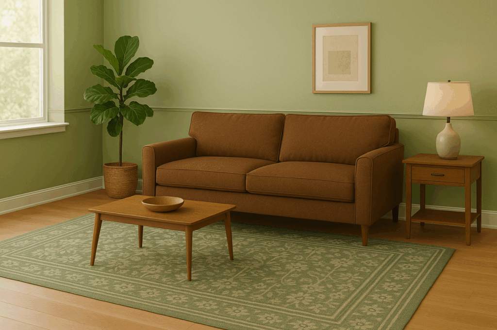
なぜうまくいくのか
- アース・インスパイアード・ハーモニー 森の床やなだらかな丘を思い浮かべてください。セージとオリーブが屋外を引き込み、ブラウンが自然のパレットと呼応するのを助けます。これらの落ち着いたグリーンは、木やレザーの感情的・視覚的な暖かさと、新鮮な活力の架け橋となります。
- アンダートーンのお見合い セージはしばしばグレーやイエローに傾き、柔らかさや暖かさを演出します。重要なのは、ブラウンの色調と感情的に共鳴する色合いを選ぶことです(あなたのソファは赤みがかったウォールナットですか、それともクールなエスプレッソですか?)
- エビデンスに基づくパフォーマンス ZillowとBetter Homes & Gardensによると、オリーブグリーンをキッチンやアクセントキャビネット、壁などに取り入れると、家の再販価値が上がり、$1,600円ほどプラスになる。専門家は、2025年のインテリアを落ち着かせ、かつ高めることができる最高の「スカラーニュートラル」と呼んでいる。
関連記事 プリントナイロンラグのカラートレンド:2025年に何が注目されるか
スタイリング戦略
A.アクセントとしてのセージグリーン
- カーテンとクッション: ブラウンレザーのソファにセージグリーンのスローピローやリネンのカーテンを重ねる。Better Homes & Gardens』誌では、セージ柄の窓パネルが木製家具を温めると同時に、文字通り屋外を縁取る方法を紹介している。
- ミックス・ニュートラル: セージにトープ、クリーム、マッシュルームグレーのアクセントを合わせると、ウッドやブラウンの家具を加える前に、ソフトで重層的なベースができあがる。
B.大胆なアクセントやペイントとしてのオリーブ
- 支えるキャビネット オリーブグリーンのキッチンキャビネットは、ブッチャーブロックのカウンターと真鍮の金具で縁取られている。
- 空間を演出するドレープ ベルベットのオリーブグリーンのカーテンは、特にトライバルな枕やナチュラルな質感とのコントラストで、エレガンスとドラマを添える。
- アクセントウォール: ベッドの後ろや居心地のいい読書スペースにオリーブのペンキをひと塗りすれば、ヒュッゲレベルの居心地のいい部屋になる。茶色の木製家具やナチュラルなラグとシームレスに調和し、「穏やかな感覚」を生み出しているとフォトグラファーは評価している。
C.セージとオリーブの組み合わせ
- チャンバー・ニュアンス セージ色の壁に、スロー、花瓶、アート作品など、オリーブのインテリアディテールを重ねると、トーン・オン・トーンでまとめられ、落ち着きがあり、まとまりのある印象に。
D.素材と仕上げのヒント
- ベルベット・ミーツ・ロー ベルベットのオリーブの椅子やドレープカーテンと、荒削りの木のテーブルやレザーのラグを組み合わせて、質感に奥行きを持たせる。
- ソフトサテン塗装: キャビネットや壁には、オリーブが光を反射するようにサテン仕上げやエッグシェル仕上げを使い、茶色を基調とした栗色の染色を施した木材は温かみを加える。
実例
- キッチン禅: オリーブグリーンのキャビネットに温かみのある木のカウンター、真鍮の建具、そして戦略的に配置された茶色のアクセントが、地に足の着いたブティックホテルの雰囲気を醸し出している。
- リビングルームのオアシス 茶色のソファの脇には、セージ色に塗られた壁とクリーム色のアクセント、質感のある茶色のラグ。
- ベッドルーム・サンクチュアリ 茶色のヘッドボードの背後にはセージグリーンのパネルが張られた壁があり、リネンの枕、アースカラーの寝具、木製のサイドテーブルで和らげられ、モダンで重層的な隠れ家を実現している。
4. マスタード&オークルイエロー - エネルギーを持つ暖かさ
マスタードイエローとオークルイエローは、ブラウントーンの空間に活気をもたらすと同時に、心地よいエネルギーをもたらします。ペールイエローよりも濃厚で、ネオンよりもソフトなこの暖かみのある色合いは、地に足がついた心地よさを感じさせ、リビングエリアやキッチン、アクセントコーナーに最適です。
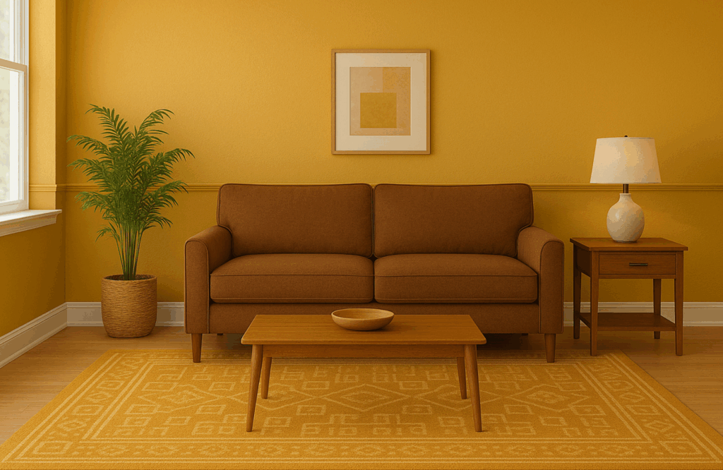
ブラウンとの相性が良い理由
- 暖かいアンダートーンとの相性 マスタードイエローは、微妙なブラウンの色調を帯び、木製素材やレザーの家具と調和している。その結果、耳障りではなく、視覚的にまとまり、感情を高揚させる。
- シーズンレス マスタードイエローはその名前とは裏腹に、秋のスタイリングを超越している。2025年のトレンドでは、黄土色は一年中部屋を明るくし、圧迫感を与えることなく自然な暖かさを強調する能力で賞賛されている。
関連記事 タフテッド・ラグのカラートレンド:2025年に何が注目されるか
スタイリング戦略
A.小さく始める
- アクセントピロー&スロー ブラウンのソファにマスタードイエローのクッションをいくつか置くと、たちまち温かみが増す。ホームデコレーションガイドは、トーンを導入するスタイリッシュで負担の少ない方法として、この方法を勧めている。
- アート作品&装飾品 マスタード・トーンの陶器、抽象的なプリント、花瓶などを考えてみよう。ちょっとした工夫でも、ニュートラルなヴィネットを明るくすることができる。
B.大胆にコミットする
- マスタード・チェア&ラグのステートメント・ピース 落ち着きのあるブラウンとナチュラルなテクスチャーの中に置かれたマスタード色のアームチェア、カーテンパネル、ラグは、たちまち居心地のよいフォーカルポイントになる。最近では、ラタンやウッド、グリーンに囲まれたマスタード色の家具を強調したボーホーリビングルームを紹介しています。
- アクセント・ウォール 黄土色(Farrow & Ballの "India Yellow "など)で壁一面を塗ると、空間が劇的に暖まり、気分が高揚すると同時に、茶色を基調としたデザインがグラウンディングする。
C.ボーホーシックな雰囲気を取り入れる
- テキスタイルと世界を旅するテクスチャー 黄土色のトレンドは、ボヘミアンなセッティングで繁栄している。重ねたラグ、柄物のクッション、編んだバスケット、テラコッタのプランターが置かれたコーナーなど、すべてがマスタード色で統一されている。
D.ナチュラルなニュートラルカラーで補う
- ベージュ、タン、ラストとの組み合わせ マスタードは、ベージュ、タン、サビといった、暖かみのスペクトルを共有する色と並べると、最もバランスがよく感じられる。デザイナーは、時代を超越した魅力的なパレットのために、このアースカラーのトリオを強調する。
実世界でのインスピレーション
- ボヘミアン・リビングルーム マスタード色のアームチェアとシャンデリアが、茶色を基調とした籐の小物や重ねたラグと調和し、個性的でポップな、居心地のよい折衷的な美学を生み出している。
- キッチン・リフレッシュ 黄土色のペンキは、キッチンや廊下のような暗い空間を明るくする。英国のファッション・エディターは、マスタードゴールドのキッチンペイントについて、「暗い季節に温かみのある、気分を高める雰囲気を加える」と述べている。
- 季節のアクセント・スキーム 季節を通して、マスタードのクッションやブランケット、小さなインテリア・アイテムは、ブラウンのインテリアを秋の居心地の良い雰囲気と春のフレッシュな雰囲気の間を行き来させ、一年を通しての魅力を際立たせる。
5. テラコッタ&ラスト - 深い大地の洗練
深いオレンジブラウンのテラコッタとラストトーンは、アーシーエレガンスの典型です。温かみと深みがあり、時代を超越した洗練を感じさせます。
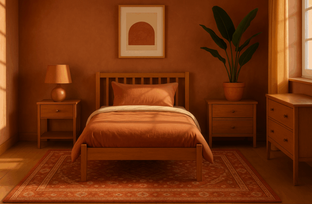
ブラウンとの相性が良い理由
- 地球に根ざしたルーツを共有する テラコッタも錆も、その美しさはミネラル豊富な天然顔料(粘土、鉄、土)に由来するもので、ブラウンの木や革にインスパイアされた温かみと調和します。
- テクスチャー・エコー 自然の土器が触覚的な不完全さを映し出すように、テラコッタのラグや錆びた色調のアクセントは、賑やかなプリントに頼ることなく視覚的な質感をもたらす。
- トレンドに左右されない暖かさ 2025年のデザイン・トレンドは、テラコッタ、黄土色、さび色といった温かみのある砂漠のパレットを強調し、バスルームの壁からリビングルームまで、あらゆる場所で見られる。このリバイバルは、快適さ、避難所、有機的な美学への欲求を反映している。
スタイリング戦略
A.大胆なアクセントウォール
- 豊かな テラコッタの特徴的な壁 茶色の木製家具や棚のドラマチックな背景になります。この土の色合いは光を吸収し、ダイニングエリアや書斎に親密な雰囲気を醸し出します。 リビングルーム.
B.ステートメントラグ&カーペット
- オレンジ色のラグ フローリングの床に敷けば、たちまち温かみが生まれます。LivingEtc.の2025選によると、深い色合いで毛足の短いラグ、特に焦げたオレンジやチョコレートのような色合いのラグは、ゾーンをはっきりさせ、居心地の良さをプラスしてくれる。
C.家具・アクセサリー
- 錆びたベルベットの椅子や革のオットマンブラウンのソファと合わせれば、リッチでボヘミアンな雰囲気に。アンティークブロンズやマットブラックの金具が、洗練された印象を高めます。
D.ミックス&マッチ・パレット
- コンバイン クリームとスレートグレーのテラコッタ また、オリーブグリーンやチャコールをアクセントにして、パレットを深めることもできる。実際の住宅撮影では、テラコッタの壁を白い縁取りで和らげ、ニュートラルな家具で引き立てている。
6.ストーングレー&チャコール - モダンなコントラスト
ブラウンと並んでストーングレーとチャコールを取り入れることで、洗練された「永く使える」美学が生まれます。これらのクールなグレーは、温かみのあるアースカラーのブラウンにバランス、モダンさ、視覚的な緊張感をもたらし、洗練され、重層的で、無理のないスタイリッシュな空間を作り出します。
ウイニングペアである理由
- 温度とトーンコントラスト ブラウンの温かみと触感の豊かさは、クールなストーングレーや深みのあるチャコールと絶妙なバランスを見せます。この相互作用が視覚的な興味と洗練を生み出し、モダンでありながら魅力的な雰囲気を実現するのに理想的です。出典の画像では、チャコールグレーのエレメントを木材と並置することで、シャープで格調高い印象に仕上げています。
- 洗練された奥行き チャコールのような深いグレーは、茶系の色調を覆い隠すことなく、劇的なコントラストをもたらし、部屋を引き締める。デザイナーはこれを「モダン・コントラスト」の決定版と呼んでいます。
スタイリング戦略
A.基礎とアンカー
- グレーの壁、ブラウンの家具:壁を温かみのあるストーングレーやチャコール(例:グリズル・グレー)で塗り、茶色の革張りのソファや木製家具、チャコールのラグを置く。こうすることで、仕立ての良さと現代的な雰囲気を感じさせる、なめらかで地に足のついた土台ができあがる。
- リバース・スキーム:ブラウンの壁とチャコールの主張のあるソファが居心地の良い繭のような空間を作り出し、クリーム色やベージュのアクセントが重苦しさを和らげている。
B.家具とアクセント
- 混合席:ブラウンのカウチソファにチャコールグレーのアームチェアやオットマンを組み合わせる。この並置は意図的で、コントラストを際立たせることなく重層的に感じられます。
- ラグ&テキスタイル:フローリングの床にチャコールのラグを敷くと、深みと視覚的なメリハリが生まれます。茶色とグレーを取り入れた幾何学模様や抽象的な柄を選ぶと、パレットがまとまります。
C.質感と素材
- 荒削りの木材と磨き上げられたチャコールの金属を組み合わせたり、ベルベットのようなグレーの布張りと素朴な木製のテーブルを組み合わせたり、チャコールに染まった石と木の梁を組み合わせて建築的な面白さを演出したり。
D.金属ブリッジ
- ゴールド、ブラス、ピューター:温かみのあるメタリックのアクセントがまとまりをもたらし、ブラウンの温かみとグレーのクールな色調をリンクさせながら、洗練さを添えている。
E.バランスとスケール
- 明暗のバランスをとることで、視覚的な調和を保つ。チャコールのアクセントウォールは、明るいグレーの縁取りやブラウンをベースにするとよい。逆に、チャコールの家具は、視覚的な重さを避けるために、柔らかい茶色やクリーム色の壁に最適です。
7.ダスティブルー&スレートブルー - 落ち着いたコントラスト
ダスティブルーやスレートブルーは、ブラウンの暖かさと巧みにバランスをとりながら、落ち着いたクールさをもたらし、落ち着きのある洗練された空間を演出します。これらの落ち着いたブルーは、氷のように冷たくなく新鮮に感じられ、アースカラーのパレットをシームレスに格上げします。
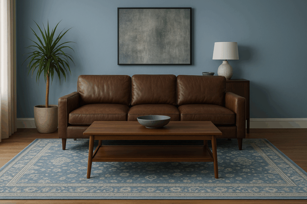
ブラウンと仕事をする理由
- 微妙なクール・コントラスト ダスティ・ブルー(彩度を落としたブルーグレー)とスレート・ブルー(グレーがかったミディアムトーン)は、ブラウンの周囲をやさしくクールダウンし、衝突することなく落ち着いた視覚的調和を生み出す。
- 気分を高める静けさ 最近のデザイン評論は、ダスティブルーを「落ち着きがあり、スタイリッシュで、暮らしやすい」と強調している。
- デザイン・ハーモニー かつてレトロのレッテルを貼られたブラウンとブルーの組み合わせが、再びモダンに感じられる。2025年のデザインプラットフォームは、この融合をリッチでエレガント、そして驚くほど新鮮なものとして称賛している。
スタイリング戦略
A.壁と天井
- フィーチャーウォール:茶色の革張りのソファや木製のベッドフレームの後ろに、ダスティブルーのアクセントウォールを配することで、深みとくつろぎが加わります。スレートブルーは、ホームオフィスやダイニングゾーンの背景にもなります。
- 天井キャノピー:天井をダスティブルーに塗ると、繭のような空中効果が生まれ、寝室や読書室には特に心地よい。
B.家具・ラグ
- スレートチェアまたはラウンジャー:ブラウンのハードウッドフロアに置かれたスレートブルーのアームチェアは、洗練された雰囲気。
- ダスティ・ブルーのラグ:絨毯の専門家が選ぶダスティブルーの絨毯は、ミディアムブラウンのフローリングの上に敷くのが理想的。
C.寝具・テキスタイル
- レイヤー寝具:ダスティブルーとソフトグレーのリネンに、クリーム色の枕を組み合わせる。
D.アクセント装飾と金物
- 真鍮またはゴールドのアクセント:真鍮の照明器具やテーブルランプ、金具を使って、ブルーとブラウンのコントラストを温め、リュクスなビジュアルバランスを作りましょう。
- ナチュラルな質感:籐、織物、緑の植物を取り入れ、アースブルーのパレットを自然と結びつける。
8.茄子とプラム - 宝石のようなエレガンス
茄子色やプラム色といった深みのある紫色は、ブラウンを基調としたインテリアに高級感と深みをもたらします。これらの宝石のような色合いは、エレガンス、イマジネーション、洗練を醸し出し、アースブラウンのパレットを次のレベルへと導きます。
ストライキング・マッチである理由
- リーガルな深みと大地の温もりの融合 オーベルジン(ナスを思わせる濃厚な紫)とプラム(赤を基調とした深い紫)は、ブラウンの温かみのある中間色を、贅沢な陰影のある色調で引き立てている。そのダークな強さは、即座にドラマと洗練を加えるが、ブラウンのアーシーなエッセンスと組み合わせても居心地の良さは変わらない。
- ジュエル・トーン・リバイバル(2025年フォーカス) ヴォーグ誌のような一流のデザイン専門誌は、2025年の「ジュエル・トーン」の復活に注目している。ベンジャミンムーアの「シナモン・スレート」(プラムに似た紫と茶色のハイブリッド)は、カラー・オブ・ザ・イヤーを受賞し、紫と茶色の洗練された融合をさらに強めている。
- 用途の多様性 これらの色調は、大胆な主張(壁、家具)としても、繊細でリュクスなアクセント(ラグ、スロー、トリム)としても機能し、マキシマリストとミニマリストの両方のスタイルにフィットします。
スタイリング戦略
A.特徴的な壁とカーテン
- 茄子の壁:パウダールームやラウンジエリアは、茄子色のウォールペイントやグラスクロスパネルでベルベットのような空間に。ブラウンの木製トリムやフローリングと組み合わせれば、ムーディーでありながら地に足のついた雰囲気に。
- プラム・ドレープ:床から天井まで広がるプラム・ベルベットのカーテンが窓をドラマチックに縁取り、光を和らげ、ブラウンの家具を引き立てる。
B.家具と椅子張り
- ステートメント・シート:温かみのあるオーク材やウォールナットの床に、茄子色のベルベットのアームチェアやソファが印象的に映えます。
- ヘッドボード&ベッドリネン:豪華なプラムの布張りのヘッドボードや羽毛布団に、ニュートラルなシーツとウォールナットのベッドサイドテーブルを組み合わせると、親密で洗練されたベッドルームになります。
C.ラグ&テキスタイル
- プラムエリアラグ:ミッドブラウンのコーヒーテーブルの下にベルベットやローパイルのプラムのラグを敷くと、宝石のような深みが生まれ、座るゾーンがはっきりします。
- アクセントピロー&スロー:茄子色の枕やスロー、ランナーを季節ごとに入れ替えれば、茶色中心の部屋がラグジュアリーにリフレッシュする。
D.金属とアクセントカラー
- ウォーム・メタリック:照明やフレームに施されたゴールド、真鍮、銅のアクセントが、紫褐色の豊かな輝きのコントラストを生み出しています。
- 創造的なコントラスト:シャルトリューズ、ティール、ソフトブラッシュのアクセントを茄子色に控えめに取り入れると、ゴールデンルールビルダーズが推奨する組み合わせと同様、フレッシュでモダンなエッジが生まれる。
9.コーラル&サンセットコーラル - 活力、バランス
ピンクがかったオレンジのトーン(コーラル)は、ブラウンの土のような土台に、爽やかで高揚感のあるコントラストをもたらす。スウィート・マグノリア サンセットコーラル 2025年の鍵となるアクセント。コーラルのラグは目を引き、ニュートラルな色調をさりげなく生き生きとさせ、タンやモカブラウンの家具と美しくマッチする。
10.ターコイズ&ブリリアント・ブルー - 活気に満ちたグラウンディング・バイブ
鮮やかなブルーとターコイズは視覚的にポップだ。ホームインテリアの情報源は、ターコイズをブラウンの際立ったパートナーとして紹介し、その結果を「活気に満ちた、地に足のついた調和」と表現しています。生き生きとしたラグやアートをプラスして、茶色を基調とした部屋を盛り上げましょう。
11.ブラック&メタリック(ゴールド/コッパー)-贅沢な深み
リュクスな美しさを求めるなら、ブラウンにブラックやメタリックを組み合わせる。Decorillaの2025年のトレンドは以下の通り。 黒のアクセントと温かみのあるメタリック ゴールド、ブロンズ、銅のような。例えば、ダークブラウンのレザーソファに真鍮の金具、ブラウンのラグに金糸をあしらうと、エレガントで洗練された雰囲気になります。
12.すべてをまとめるホリスティック・カラー・プランニング
バランスのとれたパレットを作るとき:
- 支配的な選手を1人選ぶ: 通常は茶色ベース
- アクセント・ファミリーを1つか2つ選ぶ: 例:ティール+マスタード
- テクスチャーやパターンを重ねる: ラグ、スロー、メタル、ウッドをミックス
- 音色の幅をコントロールする: 明るい色(セージ、コーラル)と暗い色(チャコール、茄子色)を組み合わせる。
- 照明とスケールをテストする: 時間帯を変えてスウォッチを試してみよう。茶色と厳選されたアクセントの相乗効果が、温かみがあり、視覚的に面白く、スタイリッシュで今風の部屋を育む。
13.結論
かつて見過ごされてきたブラウンは、今やモダンインテリアの基本。慎重に選んだ10色と組み合わせることで、落ち着きのあるオーガニックな空間から大胆でリュクスな空間まで、さまざまな空間を演出できます。青々としたグリーン、深いブルー、宝石のようなパープル、エネルギッシュなコーラルのどれを選んでも、ブラウンは万能のキャンバスとして活躍します。これらの色合いのラグを使えば、即座にインパクトのあるレイヤードスタイルが完成します。その結果は?温かみがあり、地に足がついていて、まぎれもなく2025年のトレンドの家です。
14.よくある質問
Q1: 狭い部屋には茶色は暗すぎる? A:そんなことはない。コーラルやセージ、クリーム色などの明るめのアクセントとバランスをとれば、空間が窮屈になるどころか、居心地のよさが増す。
Q2: 茶色の広葉樹の床には、どの色のラグが一番合いますか? A:ダスティブルー、テラコッタ、マスタード、落ち着いたティールなどは、ぶつかり合うことなく見事な視覚的コントラストを生み出す。
Q3: ブラウンと2つ以上のアクセントを組み合わせることはできますか? A:はい、でもひとつは大胆に、他はさりげなく。例えば、セージ色のソファ、マスタード色のラグ、ゴールドのアクセント。
Q4:プラムやティールのようなジュエルトーンは、長期的なスタイリングが難しいのでしょうか? A:枕やアート作品、エリアラグなど、控えめに使うのであれば、そうではありません。圧迫感を与えることなく、エレガンスと深みを加えることができます。
Q5: アクセントの色調は、寒色系と暖色系のどちらを選べばいいのですか? A:ブラウンのアンダートーンから始めましょう。ウォーム(赤みがかった)ブラウンは黄土色のような温かみのあるアクセントを好み、クール(灰色がかった)ブラウンはスレートブルーやチャコールと美しくマッチします。