Dans la langue de l'architecture d'intérieur, rythme est l'une de ces forces tranquilles. Vous ne le voyez pas toujours explicitement, mais vous le sentez : votre œil est attiré d'un point à l'autre, rythmé par les lignes, les surfaces et les contrastes d'une pièce. L'un des sous-types de rythme les plus fascinants est le suivant rythme d'opposition-un outil permettant d'introduire de la tension, de l'intérêt et un contraste dynamique dans les intérieurs.
Dans ce billet, nous verrons ce qu'est le rythme d'opposition, comment les tapis peuvent jouer un rôle clé, comment l'appliquer concrètement et comment choisir les tapis pour ce rôle.
Quel est le rythme opposé ?
Tout d'abord, un petit rappel. Dans le domaine de l'architecture d'intérieur, rythme se réfère à la disposition ou à la répétition d'éléments visuels (couleur, motif, ligne, texture, échelle) de manière à ce que l'œil se déplace dans l'espace de façon délibérée et agréable. Le rythme empêche une pièce de sembler statique ou décousue et contribue à unifier des zones distinctes.
Les manuels de design décomposent souvent le rythme en différents types : répétition, alternance, gradation, transition, rayonnement, etc. opposition. L'opposition, dans cette taxonomie, est le rythme obtenu par l'intersection d'éléments visuels contrastés ou opposés - lignes, couleurs, textures, formes.
La nature du rythme d'opposition
Le rythme d'opposition est un contraste délibéré. Là où la répétition ou la gradation peuvent être douces, l'opposition met les éléments en dialogue : noir contre blanc, lisse contre rugueux, anguleux contre courbé, moderne contre traditionnel. Ces contrastes génèrent une énergie visuelle, attirent l'attention et produisent souvent une harmonie surprenante grâce à la tension.
D'un point de vue structurel, le rythme "d'opposition" est parfois décrit comme émergeant de l'intersection d'angles droits (la rencontre de formes verticales et horizontales) ou de la tension d'axes juxtaposés. L'opposition permet également un contrepoint : des textures, des matériaux ou des formes contrastés peuvent se mettre en valeur par leur différence.
Quel est le rôle des tapis dans les rythme opposé
Lorsqu'il s'agit d'appliquer un rythme d'opposition dans une pièce réelle, les tapis sont des agents puissants. Pourquoi ?
Les tapis comme éléments de contraste
Un tapis peut servir de point d'ancrage visuel ou d'"élément opposé" dans une pièce. Imaginez une pièce aux surfaces lisses et nettes - un sol en béton poli, du verre, du métal, un ameublement minimal. L'introduction d'un tapis texturé tapis en laine ou tapis de jute apporte le contraste : douceur, chaleur, irrégularité. Ce tapis ne se contente pas de se fondre, il s'oppose à la domination des matériaux rigides et enrichit ainsi la tension visuelle.
De même, les contrastes de couleurs ou de motifs du tapis peuvent faire écho ou amplifier l'opposition d'autres éléments : un tapis vif dans une pièce aux tons neutres, ou des motifs géométriques contre des formes organiques dans une pièce. Les designers utilisent souvent les tapis à dessein pour injecter ce type de variance visuelle.
Délimiteur spatial et nœud rythmique
Les tapis permettent également de définir des zones dans les pièces ouvertes ou polyvalentes. Le rythme d'opposition étant une question de contraste et de tension, un tapis peut délimiter "ici, c'est la zone de vie" et "au-delà, c'est la zone de repas", en utilisant une forme, un bord ou un motif pour contraster avec le reste du sol. Cela devient un nœud rythmique dans le flux visuel : l'œil marque une pause, puis poursuit son chemin.
Échelle, motifs et arêtes
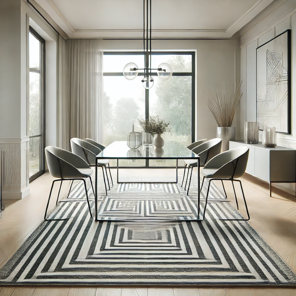
Les bords des tapis - leur forme, les lignes de bordure, l'orientation des motifs - peuvent s'opposer visuellement aux lignes architecturales (murs, fenêtres, poutres). Un tapis rond sous une table carrée ou un tapis décalé dans une pièce rectangulaire est un jeu de formes explicite. Les motifs des tapis (géométriques audacieux) peuvent s'opposer à des sols ou des surfaces murales plus simples. Comme le tapis est un plan proche du sol, ses contrastes tendent à fonder le jeu plutôt qu'à flotter en arrière-plan.
Comment utiliser le rythme de l'opposition dans la décoration d'intérieur
Passons maintenant à la partie la plus amusante : comment intégrer consciemment un rythme d'opposition dans les pièces ?
Commencer par une vision et un ancrage
Commencez par déterminer une esthétique dominante ou un langage matériel - par exemple, des lignes épurées, une palette minimale, des surfaces lisses. Identifiez ensuite un ou plusieurs éléments qui peuvent s'opposer cette ligne de base. Le contraste doit être intentionnel et non aléatoire.
Jouer à l'opposition de couleurs
Introduisez des couleurs ou des tons d'accent qui s'opposent à la palette de base - contraste froid/chaud, contraste clair/foncé, couleurs complémentaires. Un seul tapis audacieux dans une teinte contrastée peut détourner l'attention et créer un effet visuel dramatique.
Opposition de texture
Comme nous l'avons vu, le contraste des textures est souvent le moyen le plus facile et le plus riche de créer un rythme d'opposition. Textiles rugueux, tissages nubby, tapis tissés contre sols durs, ou tapis soyeux contre mobilier mat.
Opposition de forme
Lorsque les murs, les meubles et l'architecture mettent l'accent sur les horizontales ou les verticales, ajoutez un tapis incurvé ou orienté en diagonale. Utilisez un tapis de forme irrégulière dans une pièce de forme régulière. Ou encore, juxtaposez des formes organiques et des formes angulaires.
Opposition d'échelle et de proportion
Utilisez un petit tapis audacieux dans une grande pièce ouverte, ou un grand tapis à motifs dans une pièce au mobilier plutôt modeste. La différence d'échelle peut créer une dynamique de poussée et de traction. L'essentiel est de trouver un équilibre pour que l'opposition ne soit pas écrasante.
Superposer les contrastes
Il n'est pas nécessaire de faire des oppositions dans une seule dimension. Une pièce bien conçue peut utiliser l'opposition de couleur, l'opposition de texture et l'opposition d'échelle en tandem, renforçant ainsi l'interaction visuelle. Le défi consiste à maintenir la cohésion.
Utiliser l'éclairage pour mettre en évidence l'opposition
L'éclairage directionnel, l'éclairage d'accentuation ou la lumière naturelle peuvent accentuer les contrastes - en projetant des ombres, en soulignant les textures, en approfondissant les contrastes de couleur. Un tapis qui capte la lumière différemment des surfaces environnantes devient plus actif dans le rythme visuel.
Espace négatif et espace de respiration
Ne forcez pas l'opposition partout. Laissez des espaces négatifs pour que vos contrastes puissent être lus. Trop d'oppositions contradictoires à la fois entraîneront le chaos, et non le rythme.
Zones de transition
Lorsque les pièces se rejoignent (plan ouvert), utilisez les tapis comme des éléments de transition qui transmettent ou interrompent le rythme. Par exemple, si une zone utilise un tapis à rayures, laissez la zone adjacente utiliser un motif opposé audacieux, afin que la transition visuelle soit dynamique plutôt qu'abrupte.
Tester, ajuster, répéter
Le rythme d'opposition est expérimental. Posez un tapis dans un espace, vivez avec pendant quelques jours et observez la façon dont votre œil se déplace. Si le contraste vous semble choquant, adoucissez les bords avec des coussins complémentaires ou en superposant les couches. Ajustez jusqu'à ce que la tension soit productive et non chaotique.
Comment choisir des tapis pour rythme d'opposition dans l'architecture d'intérieur
Pour que les tapis soient des outils efficaces dans l'opposition des rythmes, le choix est important. Voici un guide adapté à Valhaken tant que marque de tapis.
Choix des matériaux et des textures
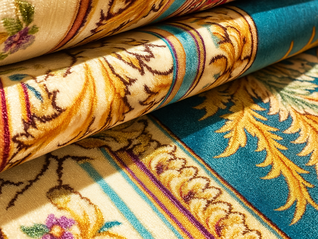
- Texture très contrastée: Choisissez des tapis dont la texture est très différente de celle du sol existant (carrelage lisse, bois poli, béton). Par exemple, un shag à poils hauts, noué à la main La laine ou le tissage plat texturé apporteront du contraste.
- Matériaux mixtes: Les tapis qui combinent les matériaux (laine + jute), soie ) peuvent intérioriser les micro-oppositions, amplifiant ainsi leur pouvoir visuel.
- Contraste de finition: Un tapis mat dans une pièce brillante ou un tapis semi-lustré dans une pièce à dominante mate peut jouer le rôle de contre-pied.
Stratégies en matière de couleurs et de motifs
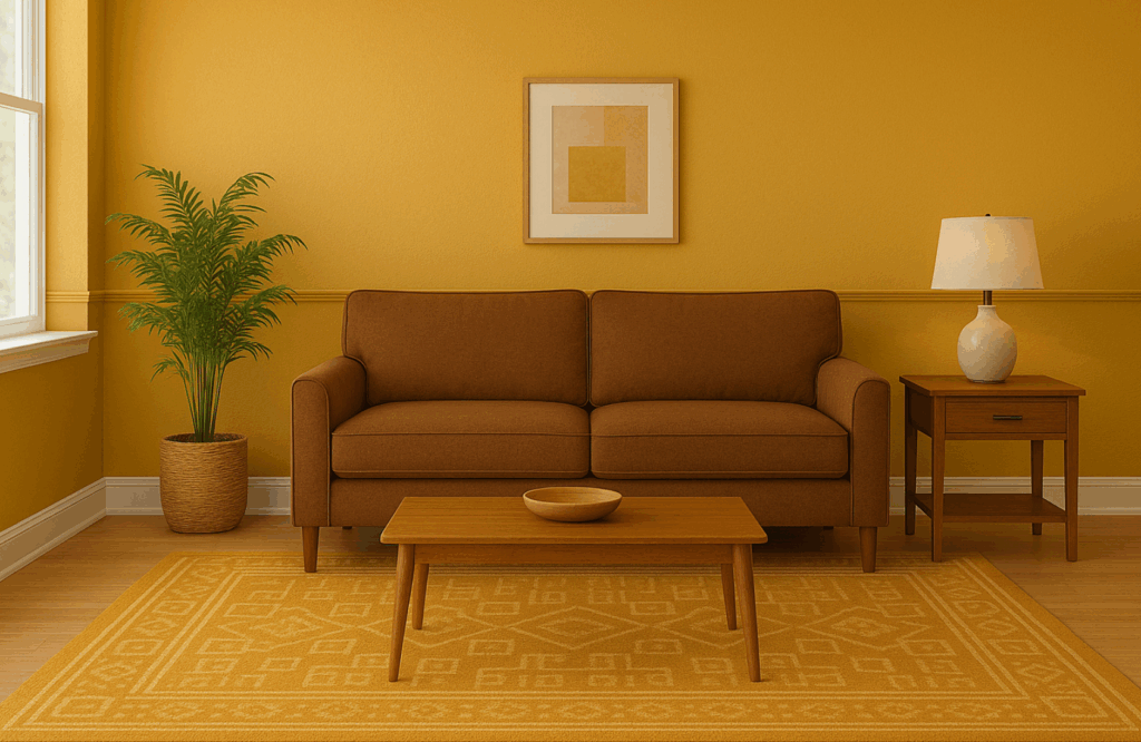
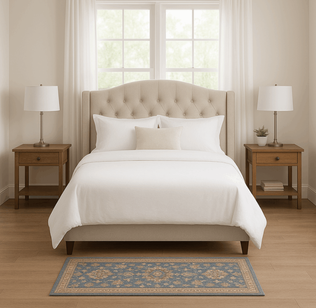
- Tapis d'accent pop: Utilisez des tapis avec des couleurs fortes (par exemple, des tons de bijoux, des indigos profonds, de la moutarde) dans des pièces à dominante neutre.
- Tapis à motifs audacieux: Les motifs géométriques, tribaux ou graphiques conviennent bien. Les motifs de tapis qui s'opposent aux motifs unis ou subtils de la pièce se démarqueront.
- Bordures contrastées: Les tapis avec des motifs de bordure ou de bordures marqués servent de séparateurs visuels ou d'opposants par rapport à un sol continu.
Forme, orientation et bordure
- Formes non standard (ovale, hexagone, irrégulier) sont intrinsèquement contrastés dans une pièce essentiellement rectiligne.
- Orientation décalée: Ne centrez pas toujours le tapis ; un placement décentré peut créer une opposition subtile et un mouvement visuel.
- Tapis à bordures: Les tapis à bordures définies créent un contraste entre l'intérieur et l'extérieur de la surface du tapis, ce qui renforce le rythme.
Échelle, proportion et superposition
- Choisir l'échelle avec discernement: Un tapis beaucoup plus grand ou beaucoup plus petit que la taille "attendue" devient une opposition délibérée.
- Tapis en couches: Utilisez un petit tapis à motifs sur un grand tapis texturé pour superposer l'opposition en deux couches et créer de la profondeur.
- Contraste dans la hauteur des poils: Un tapis à poils ras sous un tapis à poils plus épais, ou vice versa, peut mettre en valeur la superposition.
Considérations pratiques et cohésion
- Ancrage cohésif: Bien que votre tapis soit conçu pour contraster, il doit tout de même partager un fil conducteur (une teinte, un ton d'accent, un motif) afin que la pièce ne soit pas visuellement éclatée.
- Durabilité et usure: Opposition ne veut pas dire manque de praticité - choisissez des tapis adaptés au trafic piétonnier, en particulier dans les zones à forte fréquentation.
- Compatibilité d'échelle: Même s'il est contrasté, le tapis ne doit pas se battre visuellement avec le mobilier. S'il est trop discordant, il donnera l'impression d'être décousu.
L'avantage de Valhak dans la conception du rythme de l'opposition
En tant que marque de tapis comme Valhak, vous pouvez promouvoir des collections conçues pour faciliter le rythme de l'opposition :
- Lancement collections de contrastes (gras vs neutre, texture élevée) commercialisés comme "ancres de contraste".
- Offre options de tapis sur mesure où les clients peuvent spécifier des couleurs d'accentuation ou des contrastes de bordure par rapport à leur palette existante.
- Fournissez des guides de style ou des aperçus AR montrant comment le contraste d'un tapis modifie le rythme visuel de la pièce (avant/après).
- Suggérez des guides d'association : par exemple, "Si votre pièce comporte peu de verre/métal, associez-la à ce tapis en laine pour une opposition de texture".
Conclusion
Le rythme d'opposition peut sembler paradoxal : il s'agit d'utiliser le contraste, et non l'harmonie, pour produire une cohérence visuelle. Mais lorsqu'il est utilisé de manière réfléchie, il transforme une pièce statique en un espace d'énergie, de tension et d'engagement. Les tapis occupent une position unique dans cette dynamique : ils peuvent être à la fois un point d'ancrage et un élément perturbateur, en superposant les textures, les motifs, les couleurs et les formes de manière à renforcer l'impact de la conception.
FAQ
Q1. Quel est le moyen le plus simple de commencer à utiliser le rythme d'opposition dans une petite pièce ? A1. Commencez par un petit tapis texturé ou à motifs audacieux dans une pièce neutre. Laissez-le contraster avec le sol et les meubles. Observez la façon dont votre œil se déplace. Ajustez les accessoires plus petits pour qu'ils y fassent écho.
Q2. Le rythme de l'opposition peut-il être trop chaotique ? A2. Oui, si l'on en abuse. La clé est la modération, la cohésion et l'espace de respiration. Laissez des espaces négatifs et limitez le nombre d'éléments contrastés.
Q3. Le tapis doit-il être le seul élément d'opposition ? A3. Pas nécessairement. Vous pouvez superposer des oppositions (textures, couleurs, formes) sur plusieurs éléments, mais le tapis est souvent la base ou le point d'ancrage du contraste.
Q4. Les couleurs contrastées sont-elles toujours les plus efficaces ? A4. Pas toujours. Parfois, un contraste subtil (par exemple, un tapis gris clair dans une pièce de tonalité moyenne) peut apporter de la sophistication sans agressivité. L'intensité du contraste doit correspondre à l'ambiance de la pièce.
Q5. Puis-je utiliser plus d'un tapis pour créer un rythme d'opposition ? A5. Absolument. Dans les espaces ouverts, la superposition de tapis ou le placement de tapis contrastés dans des zones adjacentes peut améliorer la fluidité et le rythme visuels, mais il faut veiller à ce que l'échelle, la palette ou la texture soient les mêmes pour maintenir l'unité.